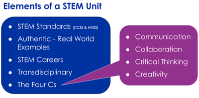
This year we are welcoming a new STEM school to the district, William H. Brown Elementary School. When planning for their introductory professional development, as a team we knew that we wanted to have the teachers participate in a high-quality STEM activity that incorporated the five elements of a STEM unit: STEM standards, authentic (real world examples), STEM careers, transdisciplinary, and the Four Cs).
My colleague, Chris Nho (email, twitter) had the brilliant idea to have the teachers participate in an activity inspired by Dear Data. Dear Data was a year-long project by Giorgia Lupi and Stefanie Posavec, two award-winning information designers. Once a week the designers sent each other personal data in the form of hand drawn postcards and through these messages, they learned more about one another. You can watch a short video about the project here.
My colleague, Chris Nho (email, twitter) had the brilliant idea to have the teachers participate in an activity inspired by Dear Data. Dear Data was a year-long project by Giorgia Lupi and Stefanie Posavec, two award-winning information designers. Once a week the designers sent each other personal data in the form of hand drawn postcards and through these messages, they learned more about one another. You can watch a short video about the project here.
Introduction
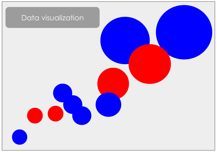
Before starting the project, we asked the participants to think about their definition of data and the common data sources that they interact with on a daily basis. We then showed participants different data visualizations and discussed how visualizations like these make complex data sets more engaging and easier to comprehend than looking at a spreadsheet. For this activity, we asked teachers to “try on” the role of data visualizers. At the time of this professional development session, there were 336 job postings related to data visualization in the Chicagoland area.
Before starting the project, we asked the participants to think about their definition of data and the common data sources that they interact with on a daily basis. We then showed participants different data visualizations and discussed how visualizations like these make complex data sets more engaging and easier to comprehend than looking at a spreadsheet. For this activity, we asked teachers to “try on” the role of data visualizers. At the time of this professional development session, there were 336 job postings related to data visualization in the Chicagoland area.
Part 1
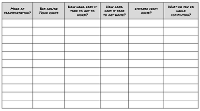
To start the project, teachers were told the they were going to collect data in the school parking lot or a local park. With a partner, teachers decided on the main questions that they want to answer and then additional questions that would give them a deeper understanding about the question they were attempting to answer. Once they settled on their questions, teachers created data tables to collect the data. To model what this process looked like, we used a hypothetical example of how teachers get to school in the morning. Teachers then took their tables outside and collected their data.
To start the project, teachers were told the they were going to collect data in the school parking lot or a local park. With a partner, teachers decided on the main questions that they want to answer and then additional questions that would give them a deeper understanding about the question they were attempting to answer. Once they settled on their questions, teachers created data tables to collect the data. To model what this process looked like, we used a hypothetical example of how teachers get to school in the morning. Teachers then took their tables outside and collected their data.
Part 2
Once they collected their data, teachers starts to analyze it. What trends did they start to see in their data? Which pieces of data did they want to include in their visualization? Which did they want to exclude? How did they want to present their data? Chronologically? By Categories? Geographically? We used our transportation example again to model what this process might look like for the teachers.
Once they collected their data, teachers starts to analyze it. What trends did they start to see in their data? Which pieces of data did they want to include in their visualization? Which did they want to exclude? How did they want to present their data? Chronologically? By Categories? Geographically? We used our transportation example again to model what this process might look like for the teachers.
Part 3
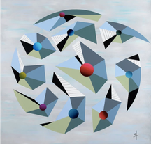
Now it was time to draw! Chris printed out images from Giorgia Lupi’s Pinterest page and hung them around the room. Each teacher was asked to choose one image that spoke to them. Once they had an image, teachers were asked to copy one meaningful part of their image onto a piece of paper. With their data in mind, they were then asked to explain how elements of their drawings could be used to visualize their data. Returning to our commute example, we used the image on the right and said that the colors could represent what activity people were doing when commuting to work and the size of the circles could represent each person’s commute length. We then gave each teacher a postcard-sized piece of paper and on one side had them visualize the data they collected using the elements from the Pinterest image they selected. The last step was to flip the card over, draw a key, write directions for how to “read” their drawing, and address the letter to someone in the class. We then mailed the letters at the end of the session.
Now it was time to draw! Chris printed out images from Giorgia Lupi’s Pinterest page and hung them around the room. Each teacher was asked to choose one image that spoke to them. Once they had an image, teachers were asked to copy one meaningful part of their image onto a piece of paper. With their data in mind, they were then asked to explain how elements of their drawings could be used to visualize their data. Returning to our commute example, we used the image on the right and said that the colors could represent what activity people were doing when commuting to work and the size of the circles could represent each person’s commute length. We then gave each teacher a postcard-sized piece of paper and on one side had them visualize the data they collected using the elements from the Pinterest image they selected. The last step was to flip the card over, draw a key, write directions for how to “read” their drawing, and address the letter to someone in the class. We then mailed the letters at the end of the session.
 Data visualization on front of postcard | 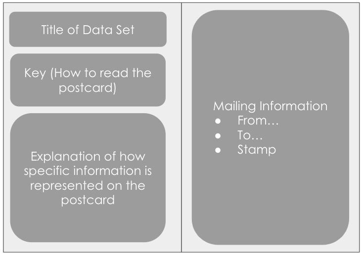 How to fill out the back of the postcard |
Finished Products
The activity was a huge success. Not only was it engaging, but it was also the perfect way to introduce the elements of a STEM unit to this staff. Check out their finished products below.
The activity was a huge success. Not only was it engaging, but it was also the perfect way to introduce the elements of a STEM unit to this staff. Check out their finished products below.